
 MobiCart
How Product Blocks Can Increase Sales in Your Shopify Mobile App
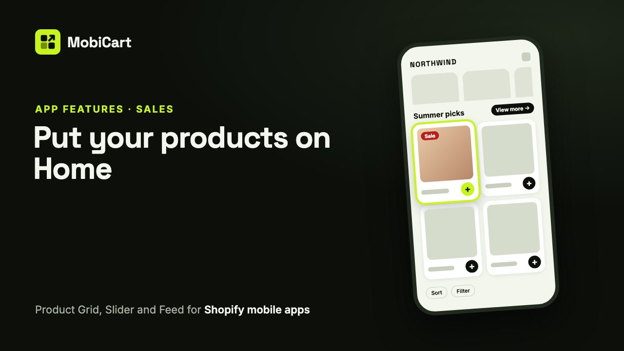
Product blocks can increase sales in your Shopify mobile app by putting products on the Home screen where shoppers land, letting them add to the cart without leaving it, and giving them more to browse the longer they scroll. This post explains how, which block to use where, and how to check the effect in your own numbers.
Short answer: every tap between opening your app and seeing a product is a chance to lose the shopper. A Product Grid, a Product Slider and an endless Product Feed on Home show products at once, and buy buttons on the cards take out the trip to the product page.
Prefer to watch? This video tutorial shows the whole setup.
What product blocks are
In MobiCart, the Home page of your app is built from blocks you add in the Builder. Three of them show products:
- Product Grid: rows of product cards, 1 to 4 columns.
- Product Slider: one row of cards that shoppers swipe sideways.
- Product Feed: product cards at the very bottom of Home that keep loading as shoppers scroll.
Each one can show your best sellers, your newest products, a collection, or products you pick yourself, and the cards update from your Shopify store on their own.
How product blocks affect sales
Four things change for the shopper. Each one takes out a step between wanting something and paying for it.
1. Products are the first thing shoppers see
A Home screen with only a banner and a menu asks shoppers to go looking. A slider of new arrivals or a grid of best sellers shows products right away, so a shopper who opened the app for a quick look sees something to buy before they decide where to tap.
2. The right products for the moment
A block can show one collection, sorted the way you choose, with sold-out products left out and a price range if you want one. That lets Home follow your store’s calendar: a sale collection sorted by price during a sale, new arrivals at the start of a season. Shoppers see what is relevant now instead of the same products every visit.
3. Add to cart without leaving Home
With buy buttons on, a round + beside the price adds the product to the cart at once, or a button row under the price offers Add to cart and, if you switch it on, Buy now. Buy now opens checkout for that one product. A product with options, such as sizes, opens a picker first, so shoppers never add the wrong variant.
4. Home never runs out
The Product Feed sits at the bottom of Home and keeps loading products, 24 at a time, as shoppers scroll. A shopper who scrolls past your banners and blocks still finds products instead of the end of the page. With Sort and Filter pills pinned at the top of the feed, they can narrow it down without leaving Home.
What we cannot tell you
We don’t have a study that says product blocks lift sales by a set percentage, and we won’t make one up. What they do is remove steps: from Home to a product, and from a product to the cart. How much that is worth depends on your products, your prices and how shoppers use your app. The section on measuring below shows how to find out for your own store.
Every option and why it matters for sales
| Option | What it does | Why it matters for sales |
|---|---|---|
| Show: Best selling, Newest, A collection, Products I pick | Chooses the products | Put proven sellers, new stock or a campaign in front of shoppers |
| Sort by, In stock only, price range | Shapes a collection | Lead with what you want to sell, never show what can’t be bought |
| Show View more link | Opens the whole collection | One tap from a preview to the full range |
| Columns or Card size | How many cards fit | Bigger photos sell looks; more columns show range |
| Show sale price and badge | Old price struck through and a Sale badge | Discounts are visible without opening the product |
| Buy buttons | + button, or Add to cart and Buy now | Shoppers can buy from Home |
| Let shoppers filter and sort (Feed) | Sort and Filter pills beside the feed’s title | Shoppers find what they want in a long list |
| List layout (Feed) | One product a row with details | Product type or a key detail at a glance |
Which to choose for your store
| Store type | Near the top | Middle of Home | Bottom |
|---|---|---|---|
| Fashion and apparel | Slider of new arrivals | Grid of a sale collection, sorted by price | Feed, 2 columns, filters on |
| Beauty and wellness | Slider of best sellers | Grid of bundles, + buttons | Feed of all products |
| Electronics and big catalogs | Slider of products you pick | Grid of a collection with View more | Feed in List layout, filters on |
| Small catalog | Grid of products you pick | Slider of new arrivals | Feed of all products |
Two rules hold for every store:
- Lead with the products most likely to sell. Best sellers or a live campaign go near the top, where every shopper sees them.
- End Home with the feed. Shoppers who keep scrolling are interested; give them products, not a dead end.
How to set it up in MobiCart
- In the MobiCart App Builder, open Home and click Add blocks.
- Under Product blocks, pick Product Grid, Product Slider or Product Feed.
- Under Products, choose what it shows with Show, and how many.
- Style the cards under Layout and turn on Buy buttons if you want them.
- Click Save as Draft, then check it on your phone with Live preview.
- Click Publish to send Home to your customers’ apps.
For every setting, read the full guide: Add product blocks to your Shopify mobile app’s Home page.
Mistakes that cost sales
The same products everywhere. A slider and a grid both on Best selling show shoppers the same items twice. Give each block a different source.
Sold-out products up front. A collection full of sold-out items wastes the best spot on Home. Turn on In stock only.
Cards too small to read. Four columns show range, but on a phone the photos and prices get tiny. Two columns, or a slider with medium cards, suit most stores.
Hiding the sale. With Show sale price and badge off, a discount is invisible until the product page. Leave it on.
How to tell if it is working
Compare a few weeks before and after you change your Home page.
- Product views from Home. More products on Home should mean more product pages opened.
- Add-to-cart rate in the app. Buy buttons should show up here first.
- Orders from the app. The number that matters in the end.
Change one block at a time, so you know which change made the difference.
Frequently asked questions
Do product blocks really increase sales?
They can, by showing products sooner and letting shoppers buy from Home. We have no percentage to promise; compare your add-to-cart rate and app orders before and after.
Should I use a Product Grid or a Product Slider?
Use a slider when space on Home is tight or you want to tease a collection, and a grid when you want shoppers to compare several products at once. Many stores use both, with different products.
Is an endless product feed good for sales?
It gives shoppers who keep scrolling something to buy instead of the end of the page. With filters on, they can narrow a long list without leaving Home.
Can shoppers buy without opening the product page?
Yes, with buy buttons on. The + button adds to the cart, and Buy now opens checkout for that product. Products with options open a picker first.
Will my product blocks stay up to date?
Yes. The app reads your products from your Shopify store, so new products, prices and sale prices show without changing the block.
How many products should a block show?
A Grid or a Slider shows up to 20. Six to eight is usually enough for a block near the top; let the feed at the bottom carry the rest.
Try it on your own store
Building and previewing your app in MobiCart is free, so you can try every product block on your own phone before you decide anything. See pricing for what each plan includes when you publish.
Planning the rest of your app? Read How a Category Browser Can Increase Sales in Your Shopify Mobile App and How Brand Colors Can Increase Sales in Your Shopify Mobile App.
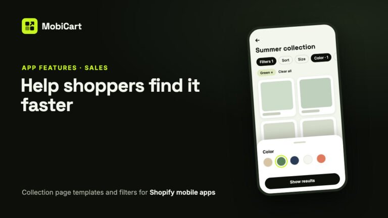
How Collection Page Filters Can Increase Sales in Your Shopify Mobile App
Collection page filters help shoppers narrow a long list to the products they would buy. How the templates, sort and Shopify filters work, and how to measure the effect.
Read article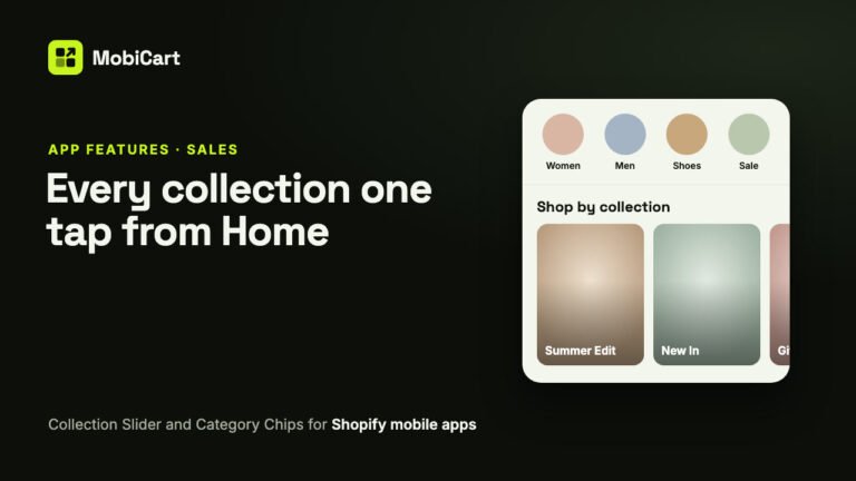
How a Collection Slider and Category Chips Can Increase Sales in Your Shopify Mobile App
A Collection Slider and Category Chips get shoppers from your app’s Home page to the right collection in one tap. Here is how that helps sales, which block to pick, and how to measure it.
Read article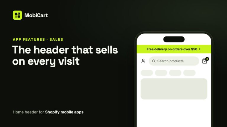
How a Home Header Can Increase Sales in Your Shopify Mobile App
A home header keeps search one tap away, shows a live cart count and puts your current offer in an announcement bar. Here is how each part affects sales.
Read article