
 MobiCart
How a Collection Slider and Category Chips Can Increase Sales in Your Shopify Mobile App
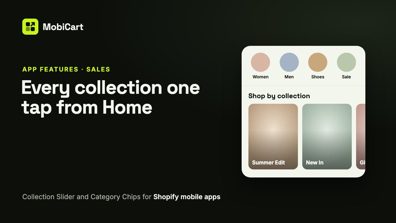
A Collection Slider and Category Chips can increase sales in your Shopify mobile app by letting shoppers go from your Home page to the right part of your catalog in one tap, instead of searching or scrolling. This post explains how each block does that, which one fits your store, and how to check the effect in your own numbers.
Short answer: most shoppers who open your app don’t know yet which product they want, but they know roughly what they came for. Collection shortcuts on Home turn “I’m looking for shoes” into the shoes collection in one tap, and every step you remove before a product page is a step where fewer people give up.
What the Collection Slider and Category Chips are
They are two of MobiCart’s collection blocks for your app’s Home page:
- Collection Slider: a titled row of collection cards, each with the collection’s image and name, that swipes sideways. Good for featuring a few collections with big pictures.
- Category Chips: a row of small round (or rounded-square) collection images with their names. Good for quick shortcuts near the top of the page.
Both show collections from your Shopify store, either the ones you pick (up to 12) or your store’s own first collections. A tap opens the collection. No code is involved.
How collection shortcuts affect sales
Each mechanism below removes one step between opening the app and seeing a product worth buying.
1. Browsing starts in the right place
A shopper who wants a dress shouldn’t have to scroll past bags and shoes first. A chip or card labelled “Women” or “Summer Edit” sends them straight to the products that match what they came for.
2. Pictures do the explaining
A collection name alone says little. A Collection Slider shows each collection’s own image, so shoppers see the style or the product type before they tap. That makes a tap more likely, and the collection page they land on less of a surprise.
3. Fewer searches that go nowhere
Search depends on shoppers knowing the right word. Collections are your words, chosen by you, with every product already sorted into place. A shopper who taps a collection can’t misspell it.
4. Your campaigns get a front door
A seasonal edit, a gift guide or a new-in collection only sells if people find it. Put it first in a Collection Slider and it sits on Home, one tap from the people opening the app.
What we cannot tell you
We don’t have a study showing that collection shortcuts lift app sales by a certain percentage, and we won’t quote one. The effect depends on your catalog, your collection images and how your shoppers browse. What we can tell you is how to measure it in your own store, further down.
What each option does for sales
| Setting | What it does | Why it matters for sales |
|---|---|---|
| Your picks (up to 12) | You choose which collections show, in Shopify’s picker | Feature what you want to sell now |
| Show my store’s collections | Shows your store’s first 6 (slider) or 8 (chips), live | New collections appear without editing the block |
| Collection name on the image | White name over a soft shade on the picture | Bigger images, a more editorial look |
| Image shape (slider) | Square, Portrait (3:4) or Landscape (4:3) | Portrait suits fashion photos; landscape suits rooms and scenes |
| Chip size and shape | Small, Medium or Large; circle or rounded square | Up to 5, 4 or 3 chips fit across without swiping |
Which block to choose
| Your store | Use | Why |
|---|---|---|
| A few main categories (Women, Men, Kids, Sale) | Category Chips near the top | Quick shortcuts that fit on one row |
| Seasonal edits and gift guides | A Collection Slider | Big images sell the idea behind each collection |
| Both of the above | Chips at the top, a slider further down | Shortcuts first, inspiration after |
| Dozens of collections with subcategories | The Category Browser | It reads your store menu and has an All sheet with search |
Two rules: every collection needs a good image in Shopify, and fewer, clearer collections beat a long row nobody reads.
How to set it up in MobiCart
- In the App Builder, open your Home page and click Add blocks.
- Under Collection blocks, pick Collection Slider or Category Chips.
- Click Pick collections and choose up to 12, or switch on Show my store’s collections.
- Set the layout: card size, image shape and where the name sits, or the chip shape and size.
- Click Save as Draft, then Live preview to try it on your phone.
- Click Publish when it looks right.
Every setting is explained in the full guide: Add a Collection Slider and Category Chips to your Shopify mobile app.
Mistakes that cost sales
Collections without images. A collection with no image shows a plain grey tile. Shoppers skip what they can’t picture. Add an image to each collection in Shopify first.
Too many chips. A row of 12 small chips is a list nobody reads. Keep the chips to the few categories most shoppers want.
Featuring empty or stale collections. A card that opens a collection with three sold-out products wastes the best spot on Home. Feature collections with stock and fresh products.
Letting Shopify pick the order by accident. Show my store’s collections shows them in the order Shopify lists them, which may not be the order you would choose. If the order matters, pick the collections yourself.
How to tell if it is working
Compare a couple of weeks before and after you add or change the blocks.
- Sales from the featured collections in the app. Products in collections you feature should sell better while they are on Home.
- Items per app order. Shoppers who browse a collection often see more than the one product they came for, so watch whether app orders grow.
Change one block at a time, so you know which change made the difference.
Frequently asked questions
Do collection shortcuts really increase sales?
They can, by getting shoppers to the right products sooner. We have no percentage to promise; compare sales of the featured collections before and after.
Should I use a Collection Slider or Category Chips?
Chips for a few quick shortcuts near the top; a slider for featuring collections with big images. Many stores use both.
What if I have hundreds of collections?
Use the Category Browser. It reads your store menu, shows subcategories and lets shoppers search every category.
Will new collections show up automatically?
Yes, if you switch on Show my store’s collections. Picked collections only show what you picked.
Do I need new images for the app?
No. Both blocks use each collection’s image from Shopify, so your app and your website match.
Can I change the blocks without a new app release?
Yes. They are part of your Home page in the Builder. Save, preview and publish, and shoppers see the change.
Try it on your own store
Building and previewing your app in MobiCart is free, so you can try both blocks on your own phone before you decide anything. The Free plan even publishes a branded Android app on your own Google Play account; paid plans start at $19 a month, are flat, and take no revenue share. See pricing for what each plan includes.
Planning the rest of your Home page? Read How a Category Browser Can Increase Sales in Your Shopify Mobile App and How Home Page Banners Can Increase Sales in Your Shopify Mobile App.
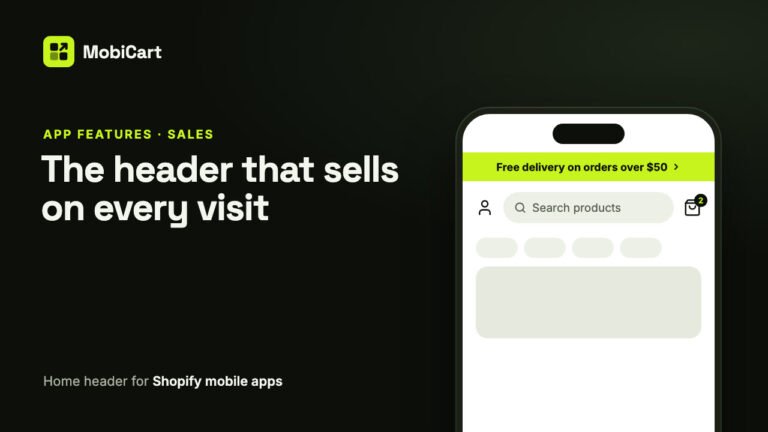
How a Home Header Can Increase Sales in Your Shopify Mobile App
A home header keeps search one tap away, shows a live cart count and puts your current offer in an announcement bar. Here is how each part affects sales.
Read article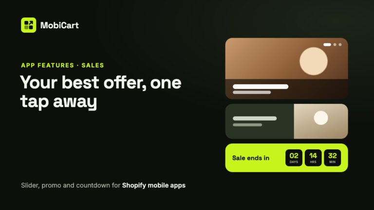
How Home Page Banners Can Increase Sales in Your Shopify Mobile App
How an Image Slider, a Promo Banner and a Countdown Timer put your best offer one tap away in your Shopify mobile app, and how to measure the effect.
Read article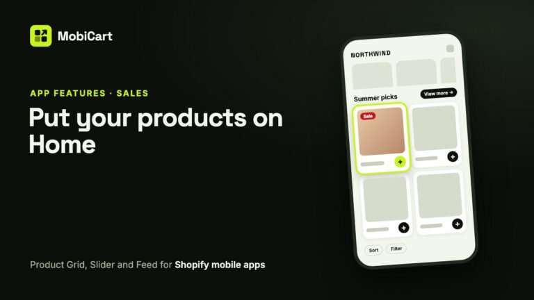
How Product Blocks Can Increase Sales in Your Shopify Mobile App
A Product Grid, Product Slider and endless Product Feed put products on your Shopify mobile app’s Home screen and let shoppers buy from there. Here is how they affect sales.
Read article