
 MobiCart
How a Bottom Navigation Bar Can Increase Sales in Your Shopify Mobile App
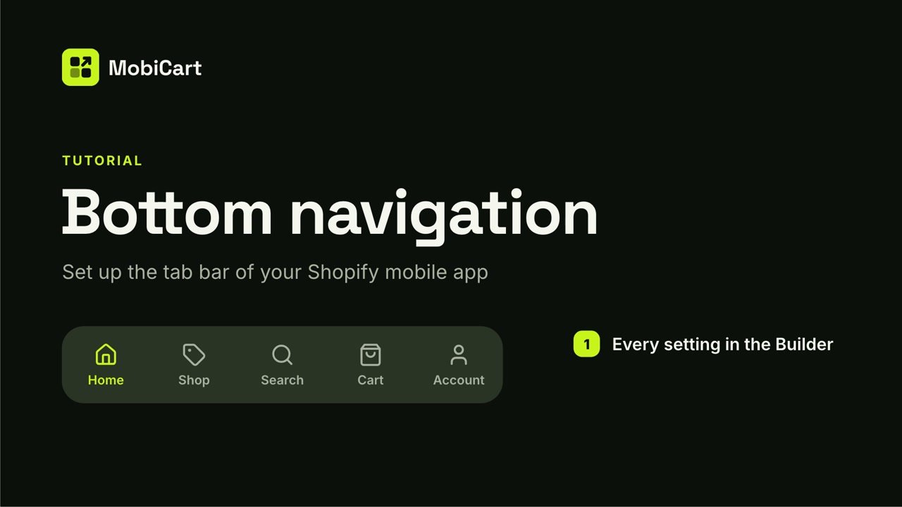
A bottom navigation bar can increase sales in your Shopify mobile app by keeping the cart, search and your categories one tap from every screen. This post explains how that works, which tabs earn their place, and how to set the bar up in MobiCart without code.
Short answer: shoppers buy more easily when the next step is always visible. A bottom navigation bar puts the three things that lead to an order, finding a product, opening the cart and checking out, under the thumb on every screen.
Prefer to watch? This 3-minute video tutorial shows the whole setup.
What a bottom navigation bar is
A bottom navigation bar is the row of tabs fixed to the bottom edge of an app. Each tab opens one main area: Home, categories, search, the cart, the account.
It is the standard pattern on both platforms. Apple calls it a tab bar. Google’s Material Design calls it a navigation bar and recommends it for three to five destinations.
Shoppers already know how it works from the other apps on their phone. That is the point: nobody has to learn your app before they can buy from it.
How a bottom navigation bar affects sales
There are four ways the bar changes what shoppers do. None of them is a trick. Each one removes a step between wanting something and paying for it.
1. The cart is never more than one tap away
Without a bar, the cart is a small icon in a header that scrolls out of view or disappears on deeper screens. With a Cart tab, it is on every screen, in the same place.
A shopper who has added something should never have to look for where it went. Every extra tap between “add to cart” and “checkout” is a chance to close the app.
2. The cart badge keeps the order in view
In MobiCart the Cart tab shows the number of items in the cart as a badge. It stays visible while the shopper keeps browsing.
That small number does quiet work. It reminds people that they have started an order, and it is still there the next time they open the app.
3. Search serves the shopper who already knows what they want
Some visitors arrive with a product in mind. They do not want to browse; they want a search box.
A Search tab gives them one on every screen. In MobiCart a tap opens search over Home, ready to type. The shopper who knows what they want is the closest to buying, so they should have the shortest path.
4. Categories serve the shopper who is browsing
Everyone else is looking around. A Categories tab opens your store’s menu in a sheet, so a shopper can jump from shoes to bags without going back to Home first.
MobiCart lets you add more than one Categories tab, each with its own menu, label and icon. A store with two big departments can give each one a tab. A store that runs on deals can put a Sale tab in the bar.
What we cannot tell you
We do not have a conversion study that says “a bottom bar lifts sales by X percent”, and we are not going to invent one.
How much the bar helps depends on your catalog, your traffic and what your app looked like before. Treat everything above as a reasoned case, then check it against your own numbers. The last section explains how.
The five tabs, and what each one does for sales
| Tab | What a tap does | Why it matters for sales |
|---|---|---|
| Home | Returns to your Home page | Your promotions and new arrivals are one tap from anywhere |
| Categories | Opens a store menu in a sheet | Browsers reach a department without backtracking |
| Search | Opens search, ready to type | The fastest path for shoppers who know what they want |
| Cart | Opens the cart, with an item-count badge | The step before checkout is always visible |
| Account | Opens the shopper’s account | Returning customers find orders and details quickly |
The bar holds up to five tabs. Home is always one of them. Cart, Account and Search can each appear once, and Categories is the only tab you can add several times.
Which tabs should you choose?
| Store type | Tabs, left to right |
|---|---|
| Small catalog, one main menu | Home, Search, Cart, Account |
| Most stores | Home, Categories, Search, Cart, Account |
| Two big departments | Home, Women, Men, Cart, Account |
| Deal-driven store | Home, Categories, Sale, Cart, Account |
Two rules hold for every store. Keep Cart in the bar, because it is the tab that leads to an order. And do not fill all five places just because you can: four clear tabs beat five vague ones.
How to set up the bottom navigation bar in MobiCart
The whole setup happens in the MobiCart Builder. No code.
- Open the page. In the Builder’s Pages list, choose Bottom navigation.
- Turn the bar on. Use Show bottom navigation, and decide whether it stays on category pages.
- Choose your tabs. A new app starts with Home, Cart and Account. Add Categories and Search, then reorder them with the arrows.
- Name them. Each label can be up to 20 characters. Leave one blank and the app uses its own translated name.
- Pick icons. Each tab type has its own icons; a Categories tab has a searchable library of 23.
- Preview, then publish. Save a draft, scan the Live preview code to try the bar on your own phone, and publish when it feels right.
The full step-by-step guide, with every setting and a troubleshooting table, is in the MobiCart docs: Set up bottom navigation in your Shopify mobile app.
Four mistakes that cost sales
Hiding the labels. “Icons only” looks clean, but a shopper who cannot tell what a tab does will not tap it. Keep labels on unless every icon is obvious.
Leaving Cart out. If the bar has no Cart tab, the cart goes back to Home’s header, and shoppers on other screens have to find their way to it.
Filling the bar with vague tabs. Five tabs with labels like “More” and “Explore” make every choice harder. Use the words your customers use: Shop, Sale, Women, Men.
A Categories tab with no menu. The app leaves that tab out, so a department you meant to feature never appears. The Builder warns you when this happens; fix it before you publish.
How to tell if it is working
Change one thing, then watch your own numbers for a couple of weeks.
- Sessions that reach the cart. If the Cart tab is doing its job, more shoppers should open the cart.
- Orders from the app. The number that matters in the end.
- What people search for. A Search tab that gets used tells you what shoppers expect to find, and what your Home page is not showing them.
If nothing moves, try a different set of tabs. The bar takes a few minutes to change and nothing reaches customers until you publish.
Frequently asked questions
Does a bottom navigation bar really increase sales?
It can, by removing steps between browsing and checkout. We have no percentage to promise. The honest test is to set it up, publish, and compare your own cart and order numbers before and after.
How many tabs should a shopping app have?
Three to five. Google’s Material Design recommends that range for a navigation bar, and MobiCart’s bar holds up to five, Home included.
Which tab matters most for sales?
Cart. It is the last step before checkout, and its badge keeps the order in view while the shopper keeps browsing.
Should tab labels be visible?
Yes, in most cases. Labels remove guessing. Hide them only if you are sure every icon is understood.
Does the bar work on both iPhone and Android?
Yes. One setup in the MobiCart Builder drives both, and each platform draws its own native bar with its own icons.
Do I need a developer to change it?
No. Tabs, order, labels and icons are all set in the Builder, and you can preview the result on your own phone first.
Try it on your own store
Building and previewing your app in MobiCart is free, so you can set up the bar, scan the preview code and tap through it on your own phone before you decide anything. See pricing for what each plan includes when you publish.
Still comparing options? Read The Complete Guide to Shopify Mobile App Builders in 2026, or see what an app really costs in The Real Cost of a Shopify Mobile App in 2026.
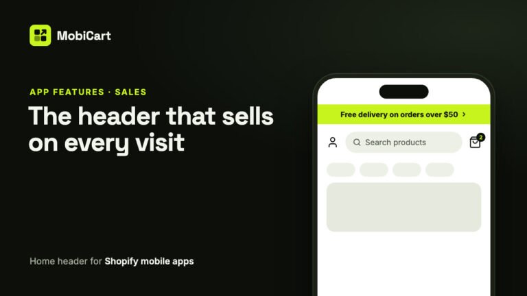
How a Home Header Can Increase Sales in Your Shopify Mobile App
A home header keeps search one tap away, shows a live cart count and puts your current offer in an announcement bar. Here is how each part affects sales.
Read article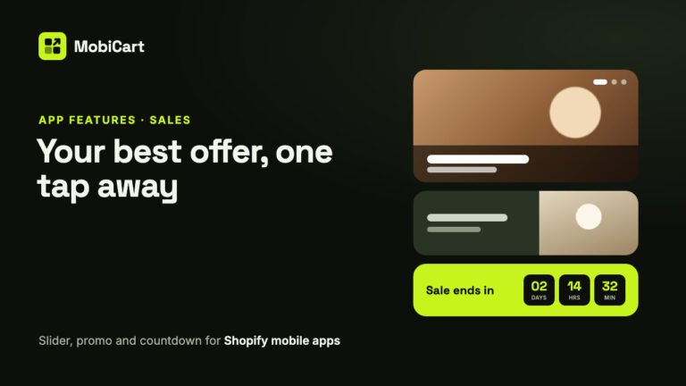
How Home Page Banners Can Increase Sales in Your Shopify Mobile App
How an Image Slider, a Promo Banner and a Countdown Timer put your best offer one tap away in your Shopify mobile app, and how to measure the effect.
Read article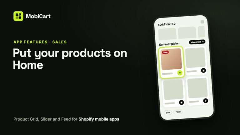
How Product Blocks Can Increase Sales in Your Shopify Mobile App
A Product Grid, Product Slider and endless Product Feed put products on your Shopify mobile app’s Home screen and let shoppers buy from there. Here is how they affect sales.
Read article